On Haemophobia
Erwin Panofsky and the psyche of a society
Ruth is a collector of writings, a site dedicated to grey literature, unpublished and experimental texts, conceived by Manuela Pacella, born from the pleasure of writing and reading. We are very glad to host a text each month, selected from one of the sections of the four-headed Ruth: Yellow Dog, Hungry Ghosts, Free Spirits, Brain New.
This month from Brain New we selected this text written by Manuela Pacella in 2019, which is reading a contemporary artwork through the lenses of Erwin Panofsky.
In 1939 the first edition of Studies in Iconology written by art historian Erwin Panofsky (1892-1968) was published. The iconology is defined by the author as “the branch of art history that deals with the subject or the meaning of artworks as opposed to their formal values.” Like Aby Warburg, (1866-1929), Panofsky was in opposition to the pure formalists of that time and he considered essential, in the correct reading of an artwork, to examine also those elements that could recall the cultural substratum of a society as well as the Seele (“psyche”).
In the introduction of Studies in Iconology, Panofsky defines and explains the three levels for a proper analysis of an artwork: the primary subject (pre-iconographical level), the conventional subject (iconographical level) and the content (iconological level).
At that time this approach was mainly applied to Italian Renaissance. I believe that it could be a useful guide to have a proper understanding of a contemporary artwork too.
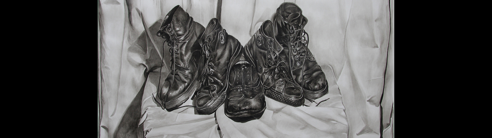
So, I have decided to apply this method to a specific artwork, a drawing done in 2014 by Miguel Martin (b. 1985 Belfast, UK), titled Haemophobia, made using Indian ink on a watercolour paper sized 59×84 cm.
Contemporary art critics are fortunate enough to be able to get in touch with the artists, to visit their studios, to be explained about their techniques, to know facts and “behind the scenes” anecdotes.
This direct dialogue with the artists offers us a unique and privileged vision of their production but, I might say, it has taken us away from a “virgin” and pure eye that allows the imagination to go far beyond reality.
The reason why certain art could be defined as “magic” is because it holds something hidden. The best artworks are those that do not disclose entirely; those that aren’t too didactic. No one wants to learn passively, but everyone wants to be always amazed and touched. One’s first connection with a work of art can begin with pure empathy and from this our curiosity awakens and we begin to wonder why and, in doing so, probably going deeper into understanding. The knowledge gained through that very first original connection is not something easily forgettable as it’s linked to an emotion, whatever it is.
This is why I will write about this specific drawing of Miguel Martin not immediately revealing what I know thanks to him, but slowly guiding you in a, hopefully, useful reading in which the elements will be unveiled as with a Russian Matrioska doll where the last doll is deliberately left half-closed, because you have to keep your curiosity active even after reading this text.
The primary subject (pre-iconographical level)
In this drawing we see 5 shoes. One, left alone by its left companion, at the centre. The other 4 are disposed, in pairs, around and over it. By saying “in pairs” I mean that the left one of a pair is on the left side of the main character-shoe at the centre and the right one is on its right side. The same happens for the other pair. The shoes are all black; they seem worn-out and almost carry a sentiment of tiredness. They are disposed in a specific order, on a very clean white fabric which functions as a background and as a tablecloth for the piece of furniture, partially visible. The style and the technique reveal an attentive, long and meticulous process that says to us that the artist spent quite a lot of time producing this drawing.
The conventional subject (iconographical level)
The way the various objects are disposed by Martin in this composition recalls some sort of sacrality that reminds us of something we’ve all seen on art history books or in museums and churches. There is a central part with some lateral elements that brings us to think of paintings with Madonna and child with Saints and Patrons all around.
The white fabric, arranged carefully to present the objects to us, clearly reminisces the tradition of still-life paintings, particularly the sixteenth-century ones by Flanders and the Netherlands masters. And a sort of memento mori is evidently included, as those sadden and over-used shoes very well declare.
The content (iconological level)
The title gives the first clue about the real content. Haemophobia is the phobia of blood. We can wonder why Martin used this title but probably we won’t reach any answers. My personal experience and knowledge could give me some insights on it but they are, in this case (and just because I spoke with the artist) totally wrong.
I have a bit of familiarity with the History of Northern Ireland and this heamophobia lead me to some strange fantasies about horrible biographical occurrences or facts that happened to the artist himself or to his family; and because the main “lonely” shoe at the centre has a vintage style, I am immediately driven to think that it once belonged to his father or grandfather, to whom some really bad thing happened.
This story fascinates me so much that I could stop here.
But my job does not allow me to do so and the artist himself provided me with useful material, including an article written by him, published on the “Visual Artists’ News Sheet” (September-October 2015) and titled Obscuring & Reveailing.
Reading the article we find out about the technique. The artwork was produced after having selected the objects and arranging them carefully in a composition done in his bedroom. The fabric is the curtain of Martin’s bedroom and this means that in all the time in which he was making the drawing he lived in semi-darkness—as he choose deliberately to represent the still life by a real observation and not through a photograph of it. It took him almost three months to complete it as using Indian ink requires a lot of carefulness because it is a permanent black ink.
We discover that this drawing was once titled Dead Shoes and it is part of a series started in 2012 having its origins in an event called Household, held in Belfast by a group of 5 young curators and that was inspired by Freud’s essay The Uncanny (1919).
We also get to know that all the shoes belong to Martin and that it’s essential to him to hide the main element he is representing. Now we have knowledge that there is something hidden.
I learned from his words today what this is: there is another shoe, the pair of the lonely one, under all the others.
And I know the reason why he changed the title. The previous title was, in my opinion, more open to imagination and this one is a bit intellectual and inserts the element of blood in a strong way.
And, yes, there is a biographical story behind the artwork but it doesn’t regard at all any battle on the ground of a civil war, but something at more basic level, related to an episode that happened when he was younger, in a place where getting drunk until losing one’s conscience is normal but, no, he wasn’t the one getting drunk and, yes, he has a phobia of blood.
I stop here because there is nothing more important than just to sit in front of this drawing, trying to observe it from the same point of view of the artist while he was doing it and admire its incredible quality, its references to art history and its wish to give back to us the factual result of drawing sitting in front of the composition.