Critical Cartography
Of technology and power across space and time
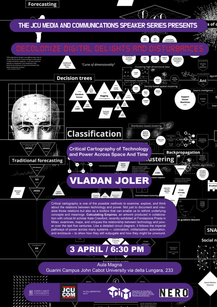
Critical cartography is one of the possible methods to examine, explore, and think about the relations between technology and power. Not just to document and visualize those relations but also as a toolbox that can enable us to rethink underlying concepts and meanings. Calculating Empires, an artwork produced in collaboration with critical AI scholar Kate Crawford, recently exhibited at Fondazione Prada in Milan, examines, maps, and critiques the relationship between technology and power over the last five centuries. Like a detailed circuit diagram, it follows the imperial pathways of power across many systems—colonialism, militarization, automation, and enclosure—to show how they still subjugate and how they might be unwound.
This talk will take place on April 3rd, at John Cabot University’s Aula Magna, at 6.30pm, as part of the program Decolonize! Digital Delights and Disturbances 2024, organized by John Cabot University’s Communications and Media Studies Department.
Digital Delights & Disturbances (DDD) offers radical ways to think out-of-the-(digital)-box we live in, imaginative and informed food for thought to feed our souls lost in the digital mayhem. The Spring 2024 edition, dubbed “Decolonize! Digital Delights & Disturbances,” features a journey through technology with a decolonial and anticolonial gaze, weaving through the intricate narratives of race, gender, and our planet’s wellbeing. This Spring 2024 edition is in collaboration with NERO and CRITT (Centro Culture Transnazionali).
In your mapping and your work at large, you show the (temporal) materiality of “so-called” ephemeral realms, such as AI and Empires, which have a very material infrastructure and heavy material consequences. How did all this come about?
Vladan Joler: Almost 10 years ago, my adventure into the invisible layers of planetary-scale infrastructures started with the investigation of one nanoscale event—the life and death of a single internet packet. Following an internet packet from my home to the Facebook data center somewhere in North Carolina revealed immense complexities of events, infrastructures, locations, and numerous government and corporate actors. From there, I became obsessed with finding ways to see those invisible infrastructures and processes, how to investigate them, and ultimately how to visualize them. At that moment, we didn’t have a clear path, but we were going deeper and deeper into infrastructures, discovering new tools and methodologies to investigate them. Over time, those visualizations became large-scale maps and diagrams. The first of those was, back in 2016, the Facebook Algorithmic Factory—a large-scale diagram of the complex and hidden algorithmic processes hidden behind what was then the biggest social network. From that moment, my investigation frame zoomed out from the algorithmic, statistical landscapes to the planetary-scale systems mapped in the Anatomy of an AI system. So, my investigations started with the nanoscale and expanded to planetary-scale systems and events. I began with a focus on how those systems work and ended up more interested in what kinds of new forms of power are hidden within those systems, how we can understand labor, and new forms of extraction framed by those systems.
How does its visualization materialize and shape?
I can say that the core and starting point of my methodology is a slow, investigative, rigorous, and hybrid research process that precedes the visualization process. I don’t see visualization itself as a final outcome but as a way of seeing, a method for gaining insight into the sometimes invisible spaces of data, correlations, and relationships. The very materiality of the systems I am interested in is usually beyond the limit of the visible. One possible way to see beyond that boundary is to find different methods of extracting the data found within those spaces and to visualize that data. In this context, data visualization is one of the methods that allows us to peek behind that opaque barrier. In this sense, visualization represents a prism for observing and understanding these spaces.
Different types of visualization allow us to see different shapes and relationships within those black boxes. One and the same set of data can be visualized in countless ways. Each of these ways allows us to see the same data space from different angles.
As with statistical methods, data visualization is never a neutral process. It is defined by the decisions of the one who visualizes the data and reflects the tools used for visualization. At the very end, visualization is not the end goal. When we have images of these flows and relations before us, the main problem is interpreting the meanings of these visual representations.
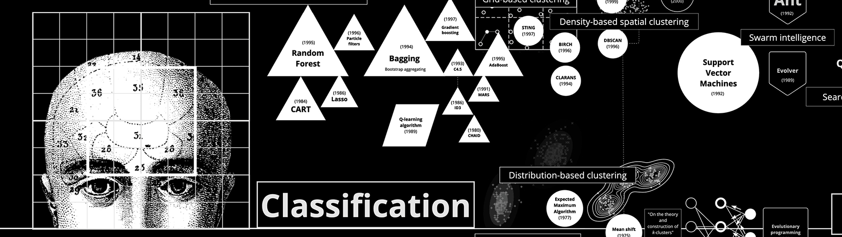
My latest maps are not the result of data visualization but more a form of cognitive mapping. Each point or line on the Anatomy of an AI, New Extractivism, and Calculating Empires is the result of a choice, a statement that emerged from research, discussion, and ultimately classification. Classifications are themselves acts of power, and no matter which data they are based on, they are filtered through the prism of the mapmakers’ own subjectivities. Thus, these maps are as much personal statements as they are conceptual, historical, and political. I see those maps more as multidimensional storytelling devices, not just as a form of visualization.
How is this visualization useful to understand a whole system of oppression and exploitation?
We are facing almost fractal-like complexities of systems that are influencing, moderating, and running our lives. Wherever we look, we see endless rhizomatic structures and complexities. Whether we are investigating planetary-scale supply chains in hardware used for training AI systems or diving deep into billions of images in the training dataset, visualizing and mapping those structures is, from my point of view, a really useful way to try to understand them. The explainability of those systems is crucial for our future, and mapping them seems like an obvious and necessary form of representation. We need maps to navigate the territories that define contemporary capitalism and contemporary power. They can be a useful tool to think about the past and present but also to try to rethink different future scenarios.
How to calculate an Empire? What are the parameters of such a calculation?
Calculating Empires is a visual manifesto critiquing the relationship of technology and power over the last five centuries. Like a detailed circuit diagram, it follows the imperial pathways of power across many systems—colonialism, militarization, automation, and enclosure to show how they still subjugate and how they might be unwound. This map is the result of a four-year collaboration with Kate Crawford. Calculating Empires is a Borgesian project. In this case, it is a map that calculates empires, while also showing how empires themselves have calculated. Calculating Empires is a provocation: in order to truly decolonize our world, we should reflect on how empires have shaped the present. By confronting the interlacing of colonialism, militarization, enclosure, and automation, we can see how they continue to subjugate and how they might be unwound. These accounts will always be incomplete—like all maps, they are inevitably partial—but in making these connections, we are able to ask different questions of ourselves, others, and the systems we live within. Each point or line on the maps of Calculating Empires is the result of a choice, a statement that emerged from research, discussion, and ultimately classification. Classifications are themselves acts of power, and no matter which data they are based on they are filtered through the prism of the map makers’ own subjectivities. Thus, these maps are as much personal statements as they are conceptual, historical, and political.
Some works are meant to be continued by the audience, how?
Each observer will understand the map in their own way, interpreting its content in accordance with their social and cultural experience and map interpretation skills. In this context, none of the offered maps is a complete sentence but represents a dynamic dialogue and, in a way, an interactive system whose final form, similar to some types of conceptual art, is realized primarily in the minds of the observers. Some of the previous maps I did in collaboration with Kate Crawford, specifically the Anatomy of an AI system, are frequently used as a tool or a starting point for future investigations in many workshops and academic curricula. Our latest map, Calculating Empires, is exhibited together with hand-made volumes and blueprint copies in the form of large-scale books, where visitors are invited to read, revise, and annotate with their own accounts of history. At each location where this work is shown, the maps will be different, reflecting the comments, stories, and experiences from the place it was last installed. The histories of the present are still unfolding, and it is only through collective re-imagining that the future can be made otherwise.