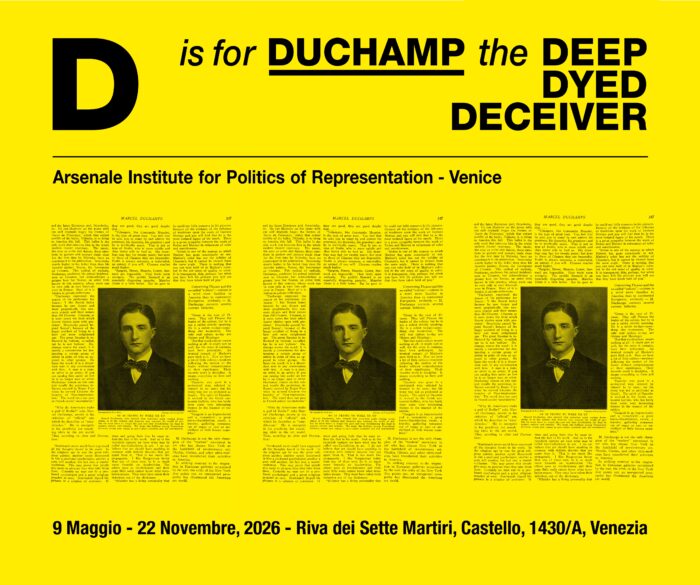
Branding a Masquerade
Simon Starling’s notes and backstories
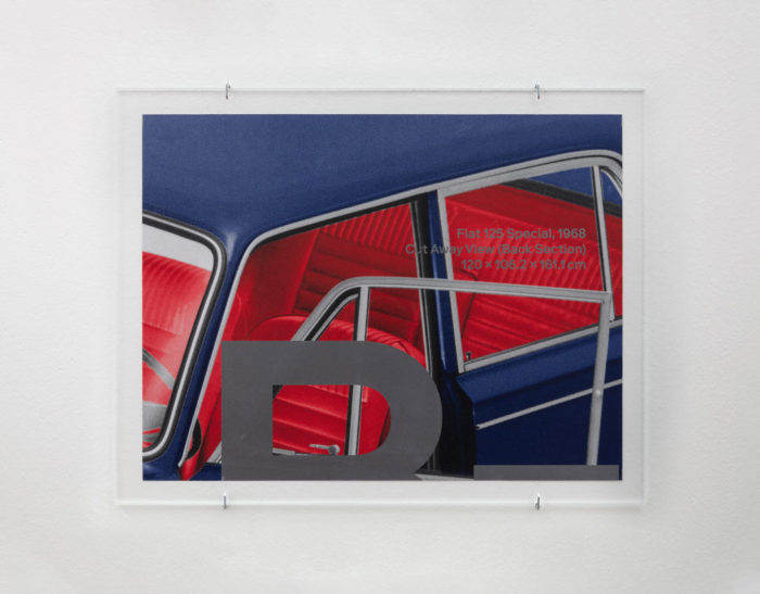
Simon Starling’s new body of work is composed of an intricate network of objects and images held together by physical transformations, juxtapositions, historical facts, speculation and the artist’s own brand of logic. The exhibition’s title, A-A’, B-B’, refers to two cuts made approximately two hundred years apart, through two very different objects—Giambattista Tiepolo’s painting The Finding of Moses and a blue Fiat 125 Special, which was a favorite car of Giovanni Agnelli, the former head of the Turin-based manufacturer and an influential Italian industrialist. Starling’s ability to identify connections in seemingly disparate narratives ties the story of the cutting of The Finding of Moses to the Fiat supremo.
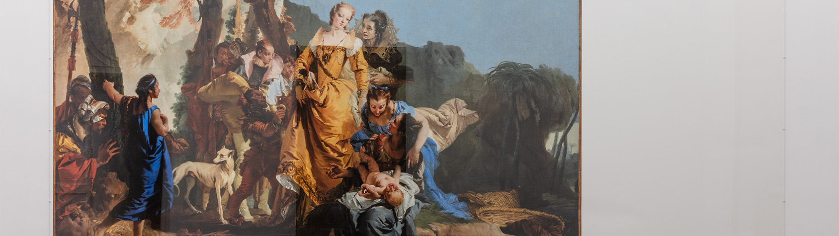
The Finding of Moses, painted circa 1738, takes a humble biblical story and glamorously restages it in the context of, what appears to be, 17th century courtly splendor with all the accompanying trappings; ladies-in-waiting, halberdiers, dwarfs and sylphlike greyhounds. Even the lowly halberdiers are dressed in noble finery. These aristocratic thoroughbreds inhabit a painting of typically eloquent artificiality and contrivance – a masquerade of sorts. In the early 19th century, Tiepolo’s dramatic painting was cut into two unequal parts, splitting the originally panoramic painting into a more conventionally centered scene, The Finding of Moses, and the somewhat unconventional A Halberdier in a Landscape. The Finding of Moses was placed with the National Galleries of Scotland, whilst the smaller half, A Halberdier in a Landscape, found itself in the Agnelli’s private collection and later tied permanently to the Pinacoteca Giovanni e Marella Agnelli in Turin. Expanding on this unique division of Tiepolo’s painting, Starling introduces Giovanni Agnelli himself into his “masquerade.”
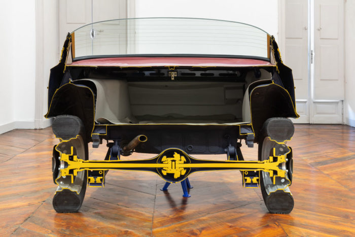
Simon Starling, A-A’, B-B’, 2019. Fiat 125 Special, 1968 / Cutaway View (Back Section) Dimensions variable. Photo Sebastiano Pellion di Persano. Courtesy Galleria Franco Noero.
A–A’, B–B’ / Notes
Dressing Up
For his painting The Finding of Moses (circa 1736–38) Giovanni Battista Tiepolo (1696–1770) took a rather humble biblical story and glamorously restaged it in the context of, what appears to be, 17th century courtly splendor with all the accompanying trappings; ladies-in-waiting, halberdiers, and a peppering of dwarfs and sylphlike greyhounds. Even the lowly halberdiers are dressed in noble finery. These aristocratic thoroughbreds inhabit a painting of typically eloquent artificiality and contrivance, a masquerade of sorts, which was heavily inspired by a painting on the same subject by Tiepolo’s Venetian precursor Paolo Veronese (1528–1588). In the early 19th century the originally panoramic painting was cut into two unequal parts, creating a more conventionally centered scene (The Finding of Moses now in the collection of the Scottish National Gallery, Edinburgh) and an enchanting, if highly unconventional, landscape with its truncated halberdier and hound (A Halberdier in a Landscape now in the Pinacoteca Giovanni e Marella Agnelli, Turin). In many ways the Halberdier was a disturbing element in the original painting, his towering presence out of sorts with the scale of the rest of the scene, but none the less typical of Tiepolo’s often dizzying compositions that seem to propose multiple viewpoints, almost as if the viewer is invited to occupy and navigate the pictorial space itself.
Simon Starling, A-A’, B-B’, 2019. Fiat 125 Special, 1968 / Cutaway View (Back Section) Dimensions variable. Photo Sebastiano Pellion di Persano. Courtesy Galleria Franco Noero.
Dressing Down
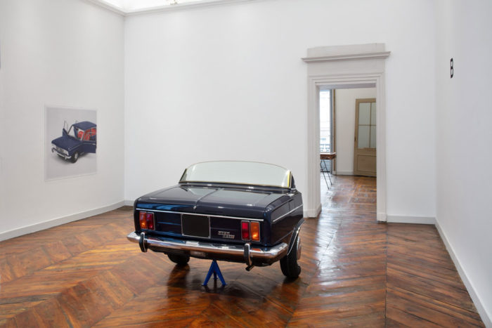
While the owner of A Halberdier in a Landscape, Giovanni “Gianni” Agnelli, Fiat supremo between 1966 and 1996, lived a largely rarefied and glamorous life, he was none the less active in trying to find common ground with the ordinary people of Turin and perhaps more significantly his own factory workers. While this “common touch” found voice in his consistent support for his beloved Juventus Football Club (Italy’s most renowned team that is owned by the family to this day), his desire to connect with ordinary people was also manifest in his choice of cars. Even though Agnelli owned a wide range of highly exclusive, custom-built cars, he was also a big fan of standard production cars. As well as owning 11 Fiat Pandas for driving in the mountains or by the sea, Agnelli or L’Avvocato (The Lawyer) as he was also known, was most often seen in Turin driving a blue Fiat 125 Special, a standard-issue family saloon with a modest 1.6 liter engine produced by Fiat between 1967 and 1972. It has been suggested that he drove this non-descript car to be anonymous and for fear of being kidnapped but these ideas are perhaps contradicted by the car’s unique, hard to obtain, number plate, A00000 TO, that signaled to the people of the city that L’Avvocato was in town.
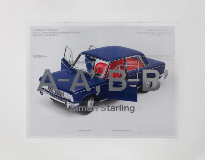
Simon Starling in collaboration with NORM and Lézard Graphique, A-A’, B-B’ (Posters), 2019. Photo Sebastiano Pellion di Persano. Courtesy Galleria Franco Noero.
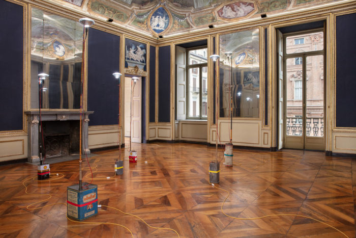
The Cut / The Cutaway
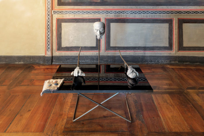
For this two-part exhibition in Glasgow and Turin, these two phenomena – these two masquerades – have been conflated in a process of both geographical transposition and material transmutation. The Scottish portion of the painting, The Finding of Moses, has been reproduced photographically at 1:1 scale and re-presented in Turin, the home of its truncated left side, A Halberdier in a Landscape. In turn a photographic reproduction of A Halberdier will appear in the Scottish gallery. Further to this geographic transposition, the somewhat brutal logic of the truncated painting, cut as it is into two unequal parts, has been applied physically to a blue Fiat 125 Special, which has been meticulously cut in the same proportions to the cut of Tiepolo’s painting, to create two similarly unequal parts. The larger front section of the 125 is exhibited in Glasgow, alongside the reproduction of A Halberdier in a Landscape, while the smaller back section of the car will accompany the larger section of the painting in the Turin exhibition.
Simon Starling, As he buffs the black lacquered table top to a mirror finish with the powdered palm of his hand, the artist catches a glimpse of the mask of the urushi master Masahiko Sakamoto that he is wearing and remembers how, when they first met, he had suggested to the craftsman, that he might be mistaken for the actor Yul Brynner playing King Siam in the film adaptation of the Rogers and Hammerstein hit musical The King and I. 2018-2019.Photo Sebastiano Pellion di Persano. Courtesy Galleria Franco Noero.
Masked Figures
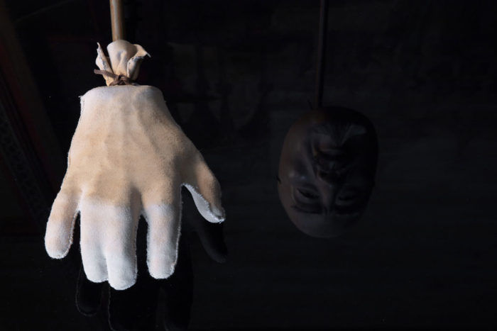
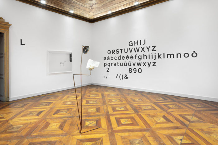
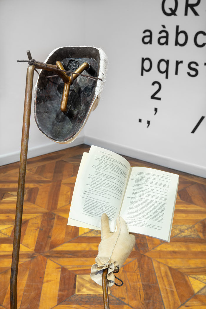
Compounding the idea of a masquerade, the exhibition will include two self-portraits of the artist – standing figures implied by simple steel armatures – wearing masks of Gianni Agnelli and Tiepolo’s Halberdier made in collaboration with master Noh mask maker Yasuo Miichi. Leather-clad casts of the artist’s right hand further define these figures – in the mask of Agnelli the artist holds the blackly-comic Dario Fo play, Trumpets and Raspberries (1974) about an exchange of identities between Agnelli and a Fiat factory worker following the attempted kidnapping of the Fiat boss, while as Tiepolo’s truncated Halberdier, he clutches a halberd while gazing eastwards, emulating the pose from the original painting.
Accompanying these two shape-shifting characters, and conceived for the exhibition space’s “chinoiserie” room, is a further cross-legged figure. Realized with both Yasuo Miichi and the urushi master Masahiko Sakamoto – this collaged figure deepens Starling’s ongoing interests in modes of production and the nature and possibilities of collaboration. Alluding to the complexities of authorship and identity inherent in any such collaboration, the work and the highly-theatrical room it occupies are illuminated by two tungsten bulbs custom-made by a third craftsman, Daniil Kondratyev. The filaments of these bulbs are as long as Masahiko Sakamoto and Simon Starling are tall.
Simon Starling, A-A’, B-B’, 2019. Photo Sebastiano Pellion di Persano. Courtesy Galleria Franco Noero.
Hands
Hands again appear in a series of three daguerreotypes entitled Hand of the Artist’s Father, Hand of the Artist, Hand of the Artist’s Son. These ghostly images, made on mirror-like sheets of silver-plated copper, seem to morph one into the other as time marks and transforms what appears to be the same hand.
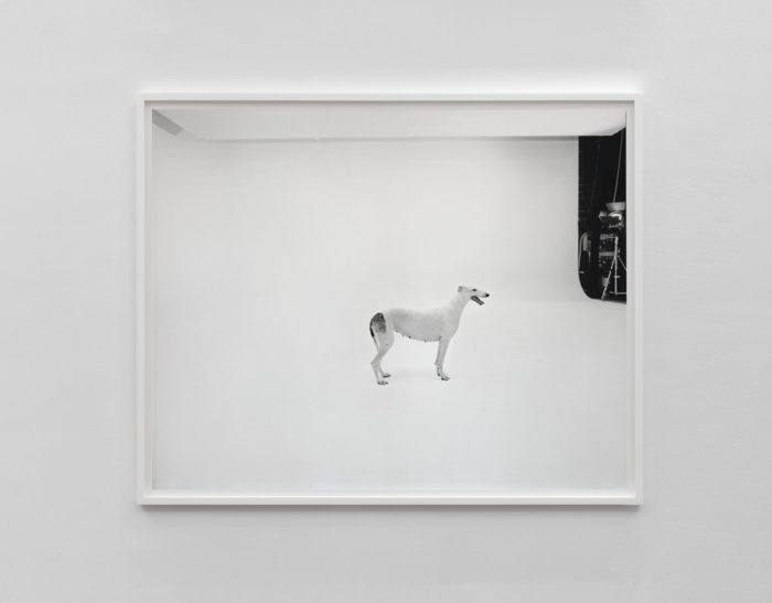
Pedigree English Greyhound, Valldemossa dell’Attimo Fuggente (Vera). Photographed at Four Studios, Mirafiori Car Plant, Turin 2019. Photo Sebastiano Pellion di Persano. Courtesy Galleria Franco Noero.
Greyhounds
Linking the regal 17th century setting of Tiepolo’s painting to the production of the late 1960s Fiat, a series of photographs of thoroughbred greyhounds has been made at the photo studios housed at the Mirafiori car plant in Turin. These large-scale studios, with their seamless white spaces designed for photographing cars and trucks become an oddly fitting setting for these predominantly white, pedigree dogs, the product of centuries of selective breeding and aesthetic refinement.
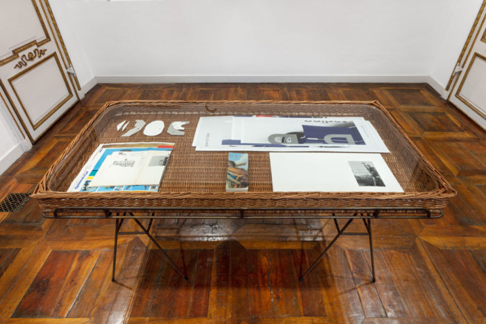
A wickerwork vitrine with steel legs made after a custom-designed roof rack for a Fiat 130 built for the Agnelli family, 1971. Photo Sebastiano Pellion di Persano. Courtesy Galleria Franco Noero.
Woven Works
The exhibition also includes a woven willow basket, inspired by a custom-made roof rack for another of Gianni Agnelli’s many cars. This basket, originally designed for carrying skies on a Fiat 130 estate car, has been transformed into a vitrine displaying a series of materials generated in the development of the exhibition as a whole, including carving stencils used by Yasuo Miichi, a guillotined monograph on the work of Giovanni Battista Tiepolo and a photograph of the missing part of the painting.
Home-made Castiglioni Lamps (Shell Rotella SX/Shell Super 200/Trading Gasoil/Olio Fiat/Benzo-Moteur/Unverkäuflich Eigentum des Lieferanten), 2019. Photo Sebastiano Pellion di Persano. Courtesy Galleria Franco Noero.
Home-made Castiglioni Lamps
The Home-made Castiglioni Lamp series continues an on-going interest in the origins of familiar design objects. Just as certain works have tracked particular materials or ideas back to source, these new sculptures re-prototype Achille Castiglioni’s iconic Toio lamp (1962), returning, that now mass-manufactured design, to its roots in a number of readily available found objects. Typical of Castiglioni’s approach to evolving designs from a collage of repurposed objects, in this case a fishing rod and a car headlamp.
Norm, Zurich present material related to the evolution of the typeface Riforma, 2019. Photo Sebastiano Pellion di Persano. Courtesy Galleria Franco Noero.
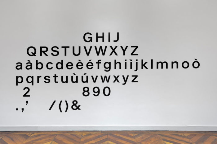
Riforma
For the exhibitions in Glasgow and Turin Simon Starling has invited Norm, the influential Zurich-based graphic design trio – Dimitri Bruni, Manuel Krebs and Ludovic Varone – to collaborate with him on the exhibition. For A–A’, B–B’ Norm have designed a large-scale silkscreen printed poster, using their font Riforma. Further to this, Norm present material related to the development of Riforma, a font with an elaborate “backstory,” a large-scale type specimen and leaflet that have, like the poster, been integrated into the labelling of the exhibition.
Norm, Zurich present material related to the evolution of the typeface Riforma, 2019. Photo Sebastiano Pellion di Persano. Courtesy Galleria Franco Noero.
RIFORMA
The reconstruction of an abandoned typeface, found in the lost design manual of an enigmatic Italian corporation—recovered, restored, and redeveloped by NORM.
I Situation
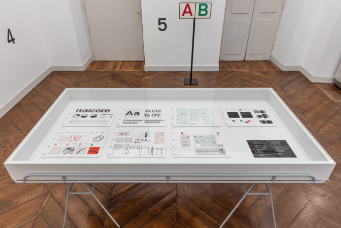
While travelling through the north of Italy in the summer of 2011, we visited a small second-hand bookshop somewhere between Modena and Milan, where we discovered a stack of books relating to graphic design, a couple of Italian type specimens, and a near-complete set of the Enciclopedia della stampa. Once back home, we discovered a bland-looking envelope between the Aggiornamento n. 9 (entitled Immagine coordinata, “Corporate identity”) and n. 12 (Schemario d’impaginazione, “Layout systems”). It contained four plastic sleeves holding fourteen 35 mm color reversal film slides and a typewritten note. Looking at the images and reading the note, it became clear that these slides were documenting an elaborate corporate design project for an Italian company by the name of Italcore.
Simon Starling, A-A’, B-B’, 2019. Photo Sebastiano Pellion di Persano. Courtesy Galleria Franco Noero.
II Observations
Envelope
A large-sized, orange envelope labelled DOCUMENTI (Documents) on a white self-adhesive sticker, written with a mechanical typewriter.
Letter
An A4-sized, blue carbon-copy duplicate note written with the same mechanical typewriter. The text translates as follows: Milan, June 5 1972, Dear Giancarlo, As agreed, I’m sending you the film slides of the presentation boards, we’ll keep the originals. As you know, our problems are still not resolved, but I’m optimistic: the plan to reform the group is in progress, and we see good prospects for the future. However, it’s unlikely they will take a decision before the end of summer. For this reason, I kindly ask you to keep the project confidential for now. As soon as I have news, I’ll be sure to contact you. It goes without saying that the quality of your work is indisputable and that the whole company is grateful to you. Best regards and speak soon, Raniero
Slides
The fourteen colour slides show reproductions of a series of presentation boards on a neutral background. Each board is hole-punched four times, with the holes being reinforced with rings. Considering the quantity, distance and dimension of the holes, we can deduct that the original boards were most probably A3 in size. Each board displays a variety of technical drawings, illustrations, symbols, layout guidelines and type composition systems, with visualizations ranging from simple to very detailed. All readable text and information is written in Italian. All transparencies are mounted in white plastic frames (50 . 50 mm). The brand name Ferrania and the inscription Made in Italy are embossed on their reverse side. The films are in good condition with few scratches, some dust, but show partial color deterioration and fading. The frames show some signs of ageing. The color slides document parts of an elaborately produced project presentation, individually showing a number of presentation boards. The reproduced boards are originally printed in three spot colors (green, red and black) on white paper. The four transparent plastic sleeves contain a total of 24 slides, with each sleeve containing six slides. We identify two numbering systems: one for the slides and one for the illustrations on the boards. The slides are hand-numbered on each plastic frame. The numbers correspond with the three-dimensional green numbers placed next to each board. The illustrations on the boards are numbered following an inherent logic. By analyzing the two different numbering systems (which are obviously not directly connected), we can deduct that at least 10 slides are missing, corresponding to the vacant spaces of the plastic sleeves. High resolution scans were made of each transparency to obtain a more detailed view.
Simon Starling in collaboration with NORM and Lézard Graphique, A-A’, B-B’ (Posters), 2019. Photo Sebastiano Pellion di Persano. Courtesy Galleria Franco Noero.
III Assumptions
Corporation
We found no historical references to any company named Italcore. The company certainly never existed as a legal entity, as there are no records to be found in the Italian Commercial Register (however, there is one entry under the name Italcore S.r.l., registered on November 3, 2016, but research shows that it has no relation to the documented project). The documents reveal a couple of business locations, one being Milan (Letter), the other Metanopoli, an industry zone outside Milan (Letterhead). Mostly, placeholder text is used for written information on the boards, such as addresses, company registration numbers, phone numbers etc., which was probably standard procedure at the time. Given the material presented on the color slides (a seven-storey headquarter building, a representative lobby, state-of-the-art transport vehicles, detailed signage, company publications), we can deduct that Italcore was projected as a national, if not international enterprise. It is unknown if the branding of Italcore was created for a newly-founded corporation or intended for the merger of two or more existing companies. The exact business domain of Italcore also remains obscure, but we can assume that the company maintained considerable transport logistics, and there are hints of involvement in various industrial activities. The visuals shown on slide 13 may indicate activities in the chemical, pharmaceutical, energy-producing, mining or construction industries. The entire corporate identity project must have been created before Italcore officially existed. We can only speculate about the reasons for this situation, which remains shrouded in mystery. The note indicates: “… the plan to reform the group is in progress.” The “group” must be a reference to the financial consortium behind Italcore which, for reasons unknown, was going through some kind of transformation. Financial or legal problems may be plausible explanations for the delay, with the developing oil crisis of the early 1970s possibly having a direct effect. The project, which was quite advanced from a design point of view, had been delayed or postponed, and finally was cancelled, as there are no further traces and no other visual records of Italcore to be found.
Designer
There is no indication to identify a branding agency and/or an actual designer as authors of the presented material. Our only clue is Raniero’s letter to Giancarlo. Even though Raniero (the contact person on the client side) talks about “… your work …,” there is no certainty that Giancarlo was the actual designer. He might well have been a studio manager or an intermediary between client and designer. We did identify one prominent graphic designer of the era named Giancarlo, whose work is aesthetically in tune with the Italcore presentation and who could have been one of the authors of the project—Giancarlo Iliprandi. However, there was no reference to Italcore in any of the numerous publications dedicated to Iliprandi’s work, and our attempts to verify his involvement produced no result. It is clear that the proposal was thoroughly developed and meticulously presented (the original presentation most probably having been produced with offset printing, a costly and unusually elaborate procedure at the time), leading us to conclude that the presentation was hardly created by one single individual, but more likely was the product of a large professional organization. The design aesthetic itself seems typical of the period, related to or even inspired by other corporate identities and branding manuals of the era. Less common, however, is the fact that a proprietiary typeface had been developed as part of the branding project. Judging from Raniero’s note, Giancarlo must have requested the return of the presentation boards, while also enquiring about the state of progress of the project. Raniero’s note—we understand from the familiar tone that the two men were on amicable terms—comforts Giancarlo, by responding that a decision about the project is postponed to “… end of summer.” Alas, it seems never to have materialized beyond the point of these presentation boards. Furthermore, it appears that the branding project was never published or made visible in any way, probably due to the non-disclosure agreement mentioned in the letter: “… keep the project confidential for now.”
Timing
Only three clues regarding the creation dates of the material are to be found. The first two are on slides 12 and 13, the project of a seemingly bi-monthly periodical, the numbering of which (from 1 to 8) suggesting that this was meant to be an ongoing series. The two drafts on slide 12 are dated 1972, while the entire series on slide 13 is dated 1971. Unlike other design proposals, the project for the magazine does not appear to be fully elaborated. On slide 13 there are still two cover options visible, and the reversed month order of January and December gives the impression that this is only a draft proposal. This indicates that such a periodical was probably part of the brief, but not planned for immediate execution. Given the nature of and the time necessary for such a publication, the designer would have chosen a more realistic future date for a first issue. This would mean that the design must have been made before January 1971, during 1970 in fact. Correspondingly, the initial work must have been initiated way before, since these slides do not show some first draft, but rather a final presentation. In which case, considering the amount and depth of material, this would mean that the project most probably began in 1969. The third clue is the letter, dated June 1972. If we conclude that the presentation of the slides took place somewhere in 1970, what happened during the period until June 1972 ? We find an indication in the note: “… it’s unlikely a decision will be taken before late summer.” Knowing how slowly such large projects proceed, we assume the presentation was submitted sometime in 1970, lay dormant during 1971, with Giancarlo being given the runaround several times, until he finally insisted to directly contact Raniero again in early 1972, upon which he received the note shown here. And that seems to be the end of the story.
Simon Starling, A-A’, B-B’, 2019.Photo Sebastiano Pellion di Persano. Courtesy Galleria Franco Noero.
Typeface
The typeface shown in the presentation appears to be genuinely original and unique, without any traces of usage beyond the documented presentation. It is obviously conceptually informed by and formally related to two well-known and influential Swiss grotesques, which had both been published some 15 years earlier, in 1957. However, it is probably even more closely related to Forma, a typeface which was brand new at the time, designed by the Italian designer Aldo Novarese for the Nebiolo foundry. In the documented presentation, there are two differing character designs that vary in their proportions. One is used for the logotype, the other is visible in the font character map, although it’s not clear which came first, the logotype or the alphabet. Another difference can be seen within the designs of optional terminals of certain letters. A specific characteristic is the aligned cut for the letters a, c, e and s. It would be no surprise if the designer had knowledge of Walter Käch’s publication Lettering (1949), where this exact formal detail is already apparent.
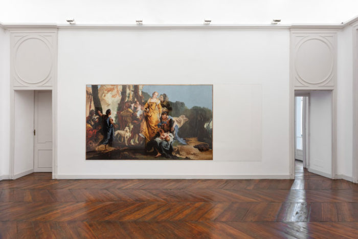
Giovanni Battista Tiepolo, The Finding of Moses, 1736–38 (Formerly the left-hand portion of A Halberdier in a Landscape) Collection Scottish National Galleries, Edinburgh. 2019. 1:1 scale archival pigment print.Photo Sebastiano Pellion di Persano. Courtesy Galleria Franco Noero.
IV Conclusion
When we decided to digitalize the Italcore typeface, our approach was to set the proportions of the letters between the two different versions distinguishable on the presentation boards. We added a stylistic set that allows use of the “logotype” version. Our starting point for the design was the weight shown on the documented presentation, which we defined as a Medium weight. Using this weight as the point of departure, we developed two lighter weights, Regular and Light, as well as two darker ones, Bold and Heavy. Being inspired by the richness of forms that accompanied the Italcore identity (such as the symbols, arrows and graphic elements that were used), we decided—true to the spirit of Giancarlo’s work—to integrate these into Riforma as well. We started work on Riforma in 2011. It was first used in the monograph 800 Views of Airports by Swiss artists Peter Fischli & David Weiss, published by JRP Ringier in 2012. Since then, it has been permanently reshaped and reformed through continuous applications in 47 projects by our studio, until we finally released it through the Lineto foundry in 2018. We named the typeface RIFORMA, paying tribute to a company reform that never happened, probably as a result of drastic business decisions—leaving behind a typeface that disappeared from sight before it could be deployed, until its unexpected reappearance nearly 50 years later. (NORM, June 2018)